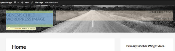
You can add in a full width responsive image header into a Genesis child theme by using the header element and set a background image to it by setting a CSS rule.
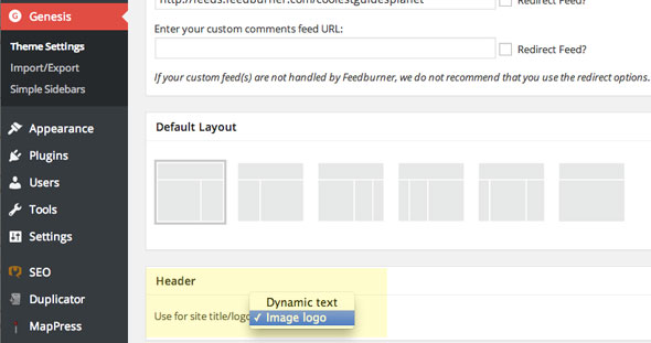
Using the Genesis sample theme as an example, in the above illustration the logo or site title will be handled with the .title-areadiv if Dynamic Text is selected or if Image Logo the .header-image .site-header .wrap CSS selectoris used, any further header content can be dealt with by the header-right widget area. The header-right widget area is pretty straightforward as this can be accessed and populated via the widget area in the WordPress Dashboard widgets area.
The .title-area can be populated with text or a background image applied via CSS. The choice is made via the Dashboard > Genesis > Theme Settings > Header
So if the Dynamic text is selected the text that gets used is another place – Dashboard > General Settings which is both the values for Site Title and Tagline.
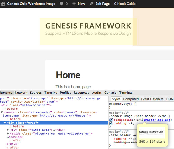
If Image logo is selected things are a little different, what happens is that a default logo (as shown below) appears in the header with a background image set to the following CSS rule – .header-image .site-header .wrapwhich displays a 360x164px logo.png image.
So what can be done is just to replace the logo with your own, and file it as logo.png in the child theme images folder replacing the existing one. Or remove that CSS rule and set the logo background to .title-area div.
The above settings may vary if you are using other Genesis themes which have had this behaviour modified.
Set the Full Width Responsive Image Header
Finally set the full width background image using the header element. The header element uses a CSS class of .site-header, CSS needs to be added to your style.css file like so:
The image you use needs to be landscape in nature and pretty much around a minimum of 1400px in width as it is going to extend to some large monitor sizes. The key CSS rule to make it responsive is the background-size:cover; rule which will make the image cover different viewport sizes. How the image is positioned at different sizes is controlled by background-position in which you can focus on a part of the image on an horizontal and vertical position using top, bottom , center, left or right.
You can set a height for the header or let the height be determined by its contents. Setting heights in responsive designs can be problematic, start without and see how that design flexes at smaller sizes.
Set the Full Width Responsive Image Header for certain Posts/Pages
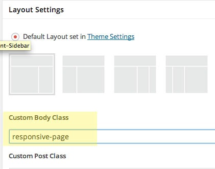
To set the responsive image to a particular page (similar to this page) you can use a custom CSS class just for that post/page by adding in the Custom Body-Class…
Just add a unique CSS custom class name.
Then adjust your CSS rules to appear just on that pages with that CSS class…