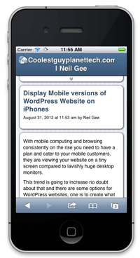
 With mobile computing and browsing consistently on the rise you need to have a plan and cater to your mobile customers, they are viewing your website on a tiny screen compared to lavishly huge desktop monitors.
This trend is going to increase no doubt about that and there are some options for WordPress websites, one is to create what is known as a responsive or fluid theme which responds and changes to the size of the screen, to set this up involves a possible full web design re-development of your WordPress theme, some themes already come with this reponsive nature, of note the default “Twenty Eleven” theme that ships with WordPress, it responds to iPad and iPhone devices and changes its display to show more content at a normal view on the smaller displays.
Typically desktop monitors are averaging at over 84% for resolutions over 1280px wide. iPads display at 1024 x 768 vertically and 768 x 1024 px horizontally and iPhones at 480x320px landscape and 320x480px depending on your orientation persuasion. So if the content is viewed unchanged at 100% of what appears in a desktop environment things will get chopped off or if viewed in a reduced proportion to fit the there will be lot of pinch zooming in and out.
If you don’t have a ‘responsive’ theme and are not ready for that path/development/cost there are a few free WordPress plugins that can make your iPhone mobile audience a bit more happy. I generally believe that viewing a regular website on an iPad is fine, it’s just the iPhone size that needs attention, as well as other mobile devices including Android and Blackberry.
3 Plugins to check out:
WP Touch
This is the grandaddy of WordPress mobile solutions, downloaded over 3.5 million times! Just download it and activate it.  There are plenty of configurable options in the backend in Settings > WPTouch. By default a whole bunch of Blackberrys, Android and iPhone will use the plugin default view and you can add more.
  Also a user viewing from an iPhone has the option to switch from a mobile view to a regular view and vice versa.
WordPress Mobile Pack
Off the bat after activation the plugin is ready to go, the default mobile theme however leaves a lot to be desired – if you don’t like it you can change the mobile theme to any other available ones to your site which is great as you can download and use a responsive theme just for mobile users whilst keeping your regular theme for other users – mobile users can also switch back to the sites regular theme from an option at the footer of the page. 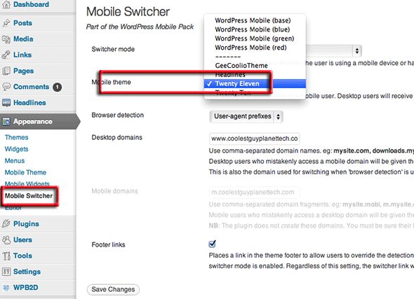 There are numerous configurable options in the Appearance > Mobile Theme and Mobile Widgets – this relates to which parts of your sites content and widgets to display to mobile users.
Mobile Domain
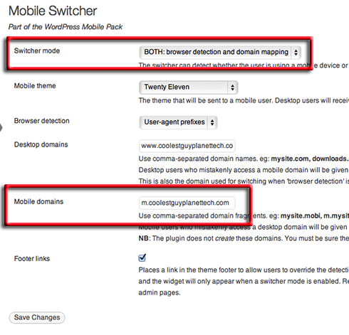 From the mobile pack you can also set a separate subdomain just for mobile users. Set the Switcher mode to browser detection and domain mapping and set the mobile domain to push those users to a separate subdomain. You have to set up that mobile domain and decide what to publish to it – you would only do this if you wanted to publish separate content to those users – this would be an advanced set up. An example of this is m.soccernet.com
Mobile Analytics
From the mobile pack you can also get stats on how many of your viewers are using mobile devices to browse your site. Go to Tools > Mobile Analytics to see the figures. 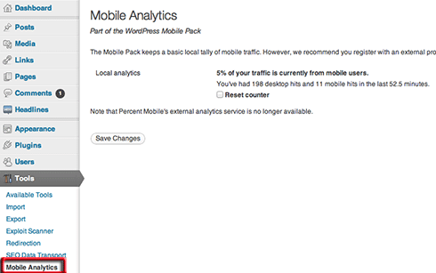 This will give you a snapshot, but also check your Google or Piwik Analytics for more detailed reporting.
WP Mobile Detector
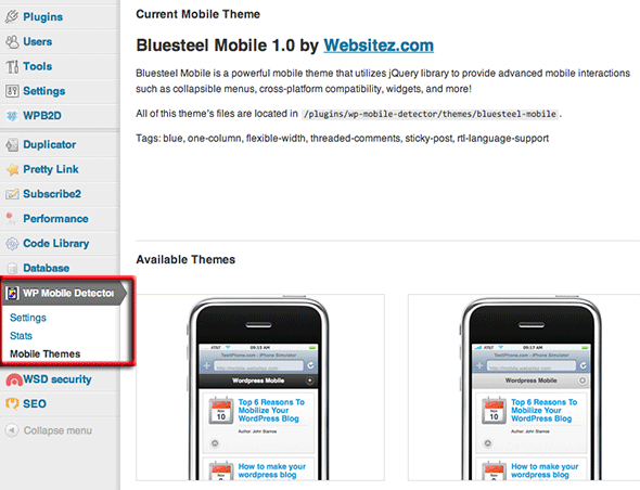
The third plugin discussed, definitely has a better mobile theme than WordPress Mobile Pack, and has more mobile themes available to choose from.
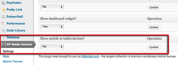
One of the settings that is default is to show the mobile theme to tablet devices such as iPad, I personally believe that these devices are OK to show the regular theme, you can change this setting in WP Mobile Detector > Settings.
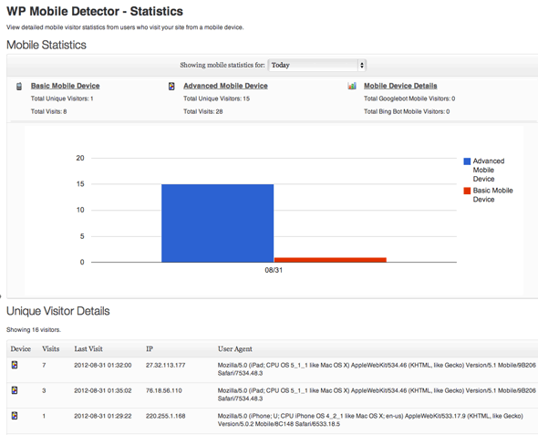
Finally this plugin also has a Mobile Stats section which throws in some details on what mobile users are visiting your site.
It’s probably best to experiment with all of them and see which one your are comfortable with I currently like the last one, WP Mobile Detector and if you just want it done quickly with no fuss use the first one WP Touch – if you are using some type of caching plugin such as W3 Total Cache make sure you empty the cache after activating the mobile plug in.
