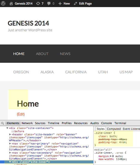
By default the inner content of a Genesis page is contained within a div with a fixed with of 1140px and centred.

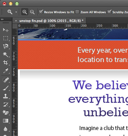
What if you need to add a full width design element that goes edge to edge of the viewport, like a gradient drop-shadow like so…

Subtle Gradient at top of white area
There is a full wrap mark-up not enabled by default… trip to functions.php
Enabling the Inner Content Wrap
Add this you your functions.php file
add_theme_support( 'genesis-structural-wraps', array('header','nav','subnav','site-inner','footer-widgets','footer') );
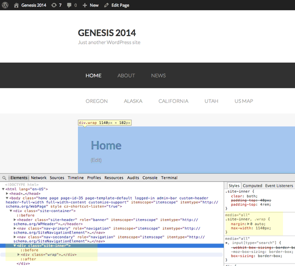
This will re-order the mark up adding a .wrap div inside the .site-inner div
Most of these already exist, what we are adding is site-inner to the array.

However the layout is still the same – this is because both the .site-inner and .wrap div share the same CSS rule of a max-width:1140px
Changing the CSS
Add these rules at the end of your CSS style sheet (or edit the originals):
.entry {
background-color:transparent;
}

.site-inner {
max-width: none;
}

@media only screen and (max-width: 1139px) {
.site-inner{max-width: none;}

}
The first rule makes the actual content area background transparent so it can be set in the site-inner instead, the second 2 rules set the width to none, one in the core css and one in the media queries.
Applying New CSS
Add a rule for your new background for the site-inner div
.site-inner {
background: linear-gradient(to bottom, rgba(0,0,0,0.20) 0%,rgba(0,0,0,0) 8%);
}
And there you have it

Gradient Background Applied to Inner Content
(The final site design has changed – however the gradient applied to the element is still in use)