How to use Slick Navigation menus in a WordPress theme, you can use the jquery responsive menus in any theme, this guide will use a clean default WordPress Twenty Twelve child theme, remove the existing responsive mobile menu used and use the slick navigation menus instead.
There is a Genesis version of the guide here.
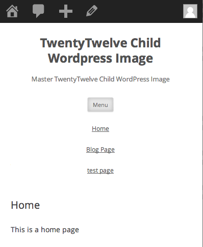
Default TwentyTwelve Menu
Removing Existing Mobile Menus
Remove Existing Javascript
//Remove 2012 Mobile Javascript
function de_script() {
    wp_dequeue_script( 'twentytwelve-navigation' );
    wp_deregister_script( 'twentytwelve-navigation' );
}

add_action( 'wp_print_scripts', 'de_script', 100 );
Add this to your child theme function.php to remove the existing javascript.
Remove HTML
Copy the parents header.php to your child theme and remove line 43.
<h3 class="menu-toggle"><?php _e( 'Menu', 'twentytwelve' ); ?></h3>
Move Menu CSS outside of Media Query
In the parent style.css file inside the Media Query targetting a min. width of 600px around about lines 1475-1549, copy and paste to your child themes style.css. This is pasted outside of any media query.
.main-navigation ul.nav-menu,
.main-navigation div.nav-menu > ul {
	border-bottom: 1px solid #ededed;
	border-top: 1px solid #ededed;
	display: inline-block !important;
	text-align: left;
	width: 100%;
}
.main-navigation ul {
	margin: 0;
	text-indent: 0;
}
.main-navigation li a,
.main-navigation li {
	display: inline-block;
	text-decoration: none;
}
.main-navigation li a {
	border-bottom: 0;
	color: #6a6a6a;
	line-height: 3.692307692;
	text-transform: uppercase;
	white-space: nowrap;
}
.main-navigation li a:hover {
	color: #000;
}
.main-navigation li {
	margin: 0 40px 0 0;
	margin: 0 2.857142857rem 0 0;
	position: relative;
}
.main-navigation li ul {
	display: none;
	margin: 0;
	padding: 0;
	position: absolute;
	top: 100%;
	z-index: 1;
}
.main-navigation li ul ul {
	top: 0;
	left: 100%;
}
.main-navigation ul li:hover > ul {
	border-left: 0;
	display: block;
}
.main-navigation li ul li a {
	background: #efefef;
	border-bottom: 1px solid #ededed;
	display: block;
	font-size: 11px;
	font-size: 0.785714286rem;
	line-height: 2.181818182;
	padding: 8px 10px;
	padding: 0.571428571rem 0.714285714rem;
	width: 180px;
	width: 12.85714286rem;
	white-space: normal;
}
.main-navigation li ul li a:hover {
	background: #e3e3e3;
	color: #444;
}
.main-navigation .current-menu-item > a,
.main-navigation .current-menu-ancestor > a,
.main-navigation .current_page_item > a,
.main-navigation .current_page_ancestor > a {
	color: #636363;
	font-weight: bold;
}
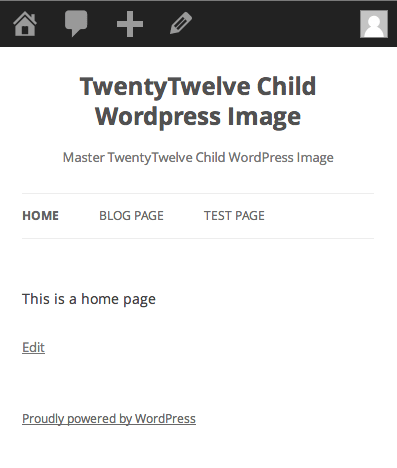
So now we have this:
Adding in the New Slick Nav Mobile Menus
Add in the Javascript and CSS
Download and name this javascript file in your /wp-content/themes/YOURCHILDTHEME/js/ folder and name it jquery.slicknav.min.js
Download and name this javascript in your /wp-content/themes/YOURCHILDTHEME/css/ folder and name it slicknav.css
function themeprefix_scripts_styles(){
wp_enqueue_style ('slickcss', get_stylesheet_directory_uri() . '/css/slicknav.css','', '1', 'all');
wp_enqueue_script ('slickjs', get_stylesheet_directory_uri() . '/js/ jquery.slicknav.min.js', array( 'jquery' ),'1',true);
}
add_action( 'wp_enqueue_scripts', 'themeprefix_scripts_styles');
This function and action loaded the core slick nav files and are added to your child function.php file.
Set the Slicknav to fire on page load
function slicknav_fire() {
$output="<script>
jQuery(function() {
jQuery('.nav-menu').slicknav();
});
</script>";
echo $output;
}
add_action('wp_head','slicknav_fire');
This is also added to the child function.php file and targets the menu with a class 0f .nav-menu
Fix CSS to show hide Mobile Navigation
The final piece is adding some CSS to your style.css file
/* .nav-menu is the original menu */
.nav-menu ul{
  display:none !important;
}
.slicknav_menu {
  display:block;
}
/*CSS Menu Style*/
  @media screen and (min-width:600px) {
  .slicknav_menu {
  display:none;
  }
  .nav-menu ul{
  display:block;
  }
}
Here I want the breakpoint set to 600px to show the mobile menu and hide the regular one – just adjust that value to your preference.
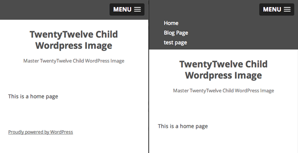
Slick Nav Dropdown menus at 600px
Thats it, there’s a bit more info on doing multiple menus and some javascript options on this Genesis/slicknav guide which is still relevant to all WordPress theme.