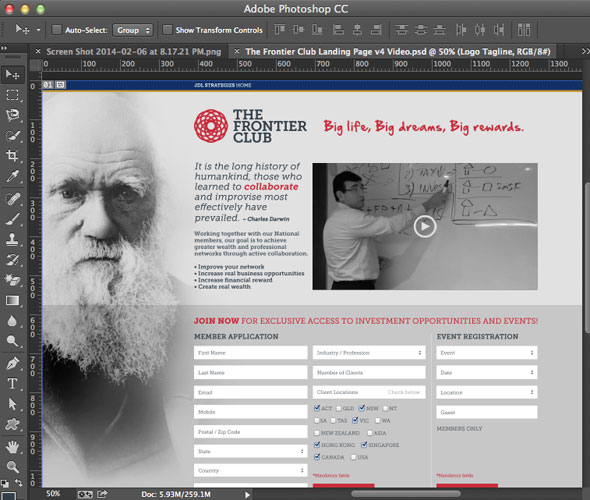
A web design normally has a horizontal full width image but what about a vertical full depth that spans the page.

Full Depth Vertical Image
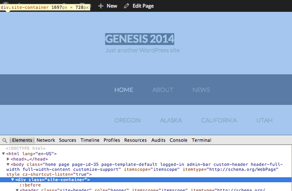
In a Genesis theme you can accomplish this by setting a background image to the .site-container div that contains all page elements

Genesis SIte Container

Image Ends Up Covered by Text at a Set Size
If the image has to be a certain width with no text or images obscuring it you need to edit the framework CSS and it’s all to do with the Genesis .wrap div and it’s parent div. The .wrap div gives a defined width and centers the content whilst its parent div is full width of the viewport, one example is the .site-header div which contains all the header elements including its child .wrap div
Adjusting the CSS
2 things need to happen to allow this layout to work and that is to adjust both the .wrap div and its parent div
The parent div needs a padding left to accommodate the width of the image and the .wrap divs need the centering power removed, making the parent divs padding element the anchor for position.
(Only 2 of the below elements are default Genesis elements the other 2 I added in extra full width wrap areas.)
.site-container {
	background: linear-gradient(to right, rgba(0,0,0,0.10) 0%,rgba(0,0,0,0) 100%), url(/my-background.png) no-repeat 0 0;

.topwrapwrapper, .site-header, .pitchwrapper,  .site-inner {
	padding-left: 430px;
}
.topwrapwrapper .wrap, .site-header .wrap , .pitchwrapper wrap, .site-inner .wrap {
	margin: 0px 0px;
}
I know my image is 430px wide so that will be the padding amount in the second CSS rule and after that in the 3rd rule the centering has been removed so the content will start straight after the image.

Final Layout