 Can you use video in HTML emails?, the answer to this is yes absolutely.
Only a couple of email clients can currently support HTML Email Video, which is not so cool;
- Apple iPhone
- Apple iPad
- Apple Mac Mail
All the rest including Outlook, Gmail, Lotus Notes and Hotmail do not support video, however they can display a fall back image when the video does not appear.
But what kind of marketshare can you hit with the 3 email clients above that can support video.
- Apple iPhone 24%
- Outlook 13%
- Apple iPad 12%
- Google Android 12%
- Gmail 10%
- Apple Mail 8%
- Outlook.com 6%
- Yahoo! Mail 5%
- Windows Live Mail 2%
- Windows Mail 2%
Well things start to look good again if you can get video to 44% of the market.
The Best Video HTML Mark Up Code
<video width="640" height="360" poster="http://myfallbackimage.jpg" controls="controls">
        <source src="http://mymovie.mp4" type="video/mp4" />
        <a href="http://mysite.com"><img src="http://myfallbackimage.jpg" /></a>
</video>
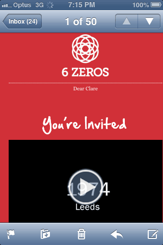
So in the code we declare the video width and height, poster image and controls and the source of the video – this will be used by the supporting Video email clients. For the non-conforming majority (for now) they will use the linked image as a fall back, so obviously this can be an engaging image linked to the video online.
The video format needs to be mp4, some background on that here.
While we are at it, let’s make it all responsive, videos and HTML emails.
The Best Responsive Video HTML Mark Up Code
Responsive email deployment should not be ignored or overlooked due to the stats above. One framework that works out of the box is Zurb Ink the same guys who brought us the Foundation Framework, with Zurb Ink you get some starter templates, a CSS styles inliner tool and great documentation.
To also include responsive video within this framework, you need to create the video at the widest size that you want to display which inevitably is going to be around no more than 580px wide. For the height we need to use a padding-top value which is the magic sauce to make it responsive, how you work it out is to divide the height by the width of the video in its pixel dimension.
<video width="100%" poster="http://myfallbackimage.jpg" controls="controls">
        <source src="http://mymovie.mp4" type="video/mp4" style="padding-top:55.25%;" />
        <a href="http://mywebsite.com"><img src="http://myfallbackimage.jpg" /></a>
</video>
In the example above the source mp4 has an inline style set to padding-top of 55.25%
Example Code
So there you have it, you can reach a large part of the market with video in email and still display a fall back image to email clients that don’t support video, the numbers start to make sense. One of the biggest caveats will be to ensure that the video delivered is as optimized as possible to deal with the bandwidth issue – a topic for anther post. Users connecting over a home or office WiFi will be fine but those on 3G cellular connections will need that video nice and trim.